App Remakes
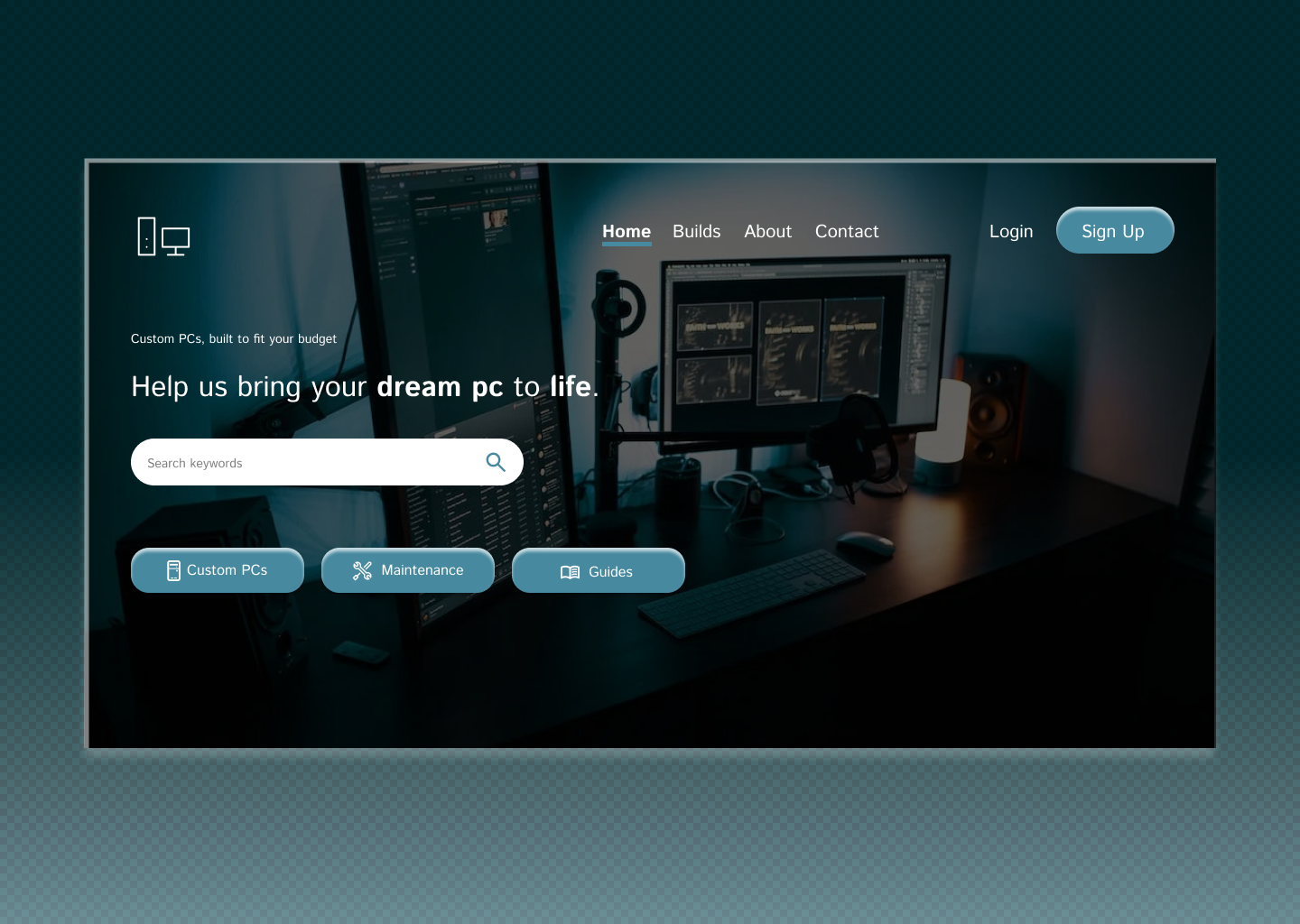
When reviewing the original design of the Bank OZK app, I found it difficult to read the Login button since the text and button were both dark. The content in the center appeared squished and the footer was difficult to read as well since the text was black on a grey background. I created my remake interactions with these key points in mind as well as adding a banner at the top of the screen.
Original
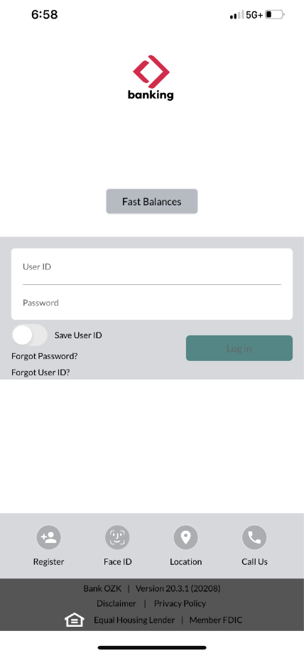
Remake
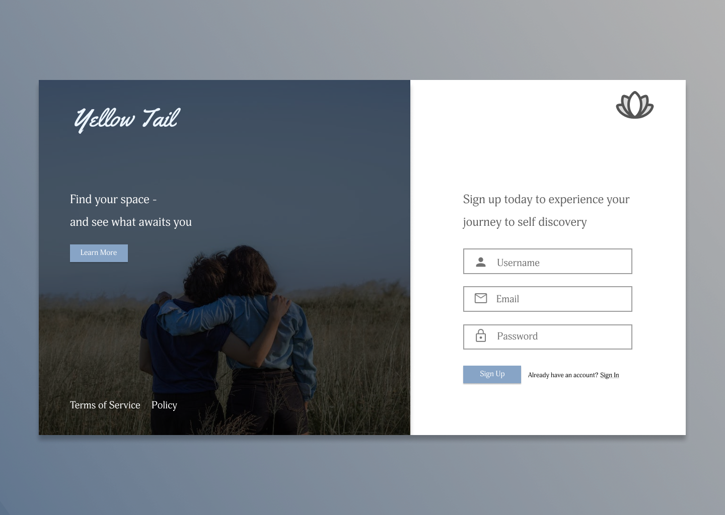
Login/Registration
I wanted to create a clean login and registration screen that had easy readability and was visually appealing for the user.
Landing Pages
This is a landing page to a custom PC building company.