Euphony
Figma | Photoshop | Mobile App
Product
Euphony is an album pre-order platform built to engage devoted music fans by simplifying how they purchase and enjoy albums anytime, anywhere
Problem Statement - Users are looking for a unified platform where they can manage their music and pre-orders seamlessly.
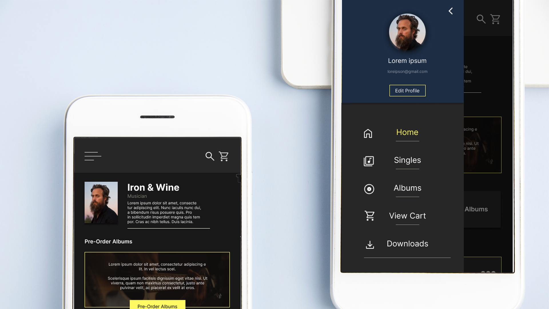
Final Mockups
Project Overview
Deliver a frictionless experience by streamlining item selection, ordering, and in‑app navigation.
As a UX designer, I’m focused on crafting an intuitive album pre‑order app that makes music purchases effortless.
My process involves conducting interviews, crafting both paper and digital wireframes, developing prototypes at varying fidelities, leading usability studies, integrating accessibility standards, and continuously refining designs
Design Process
Actively contributed to every stage of the design process — from empathizing with users and generating ideas to prototyping and rigorous testing — ensuring impactful, effective solutions.
User Research: Summary
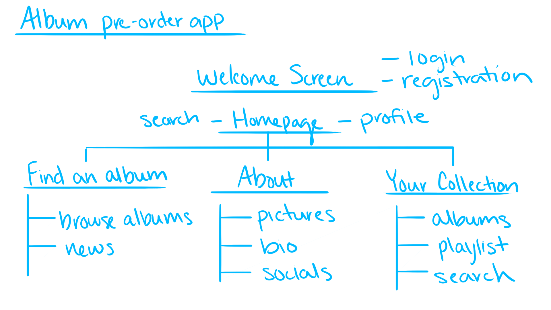
Information Archietecture
Screens overloaded with text often create a sense of overwhelm and reduce usability in apps.
Accessibility
Current platforms for album pre‑orders are not designed with assistive technologies in mind, limiting accessibility.
Time
Users seek a platform that allows them to discover music while staying updated on upcoming releases.
Competitive Audit
I carried out a competitive audit by researching both direct and indirect competitors. This process deepened my understanding of the market and clarified the objectives I wanted to achieve for my product.
Competitive AuditInformation Architecture
In developing the information architecture, I prioritized listing essential elements. However, through ideation and usability testing, I identified the need to expand content to align with user needs and enhance the overall experience.
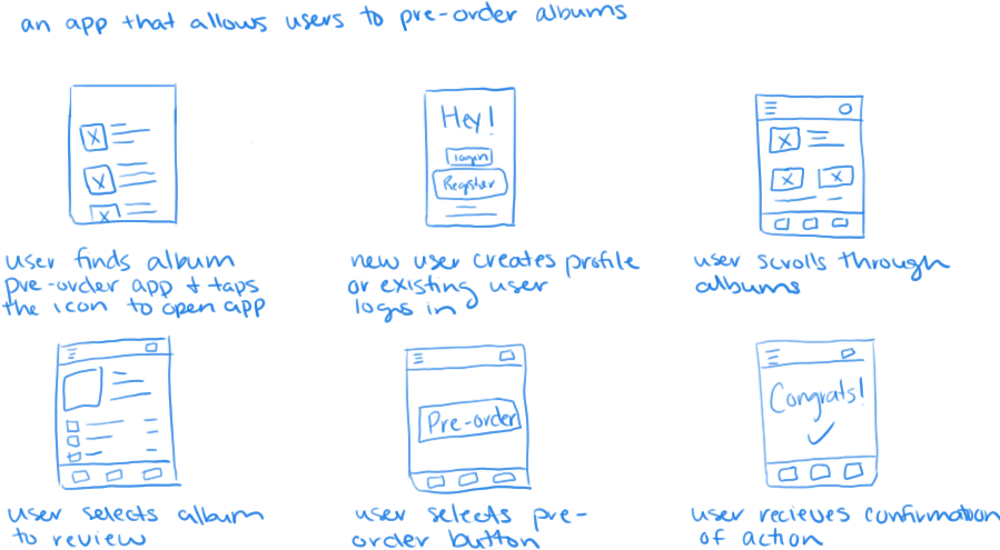
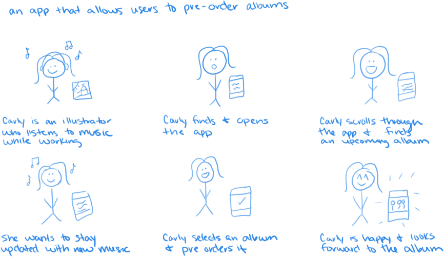
Storyboards
Close Up
In this close‑up storyboard, a user finds Euphony in the app store, signs up, explores albums, and pre‑orders their selection. The process concludes with a confirmation of the order..
Big Picture
In this big‑picture storyboard, Carly — an illustrator who loves listening to music as she works — discovers the app, explores albums, and pre‑orders one that interests her. The process concludes with her feeling satisfied and eager for the upcoming release.
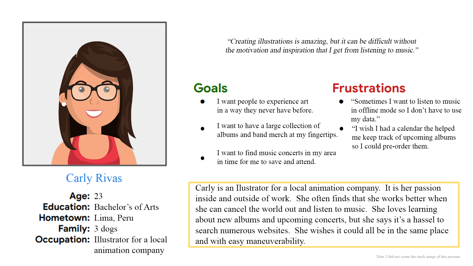
Persona: Carly
Problem Statement
Carly is an illustrator who relies on music to concentrate while working. She needs a mobile app that keeps her updated on upcoming album releases from her favorite bands, helping her stay inspired and in the zone.
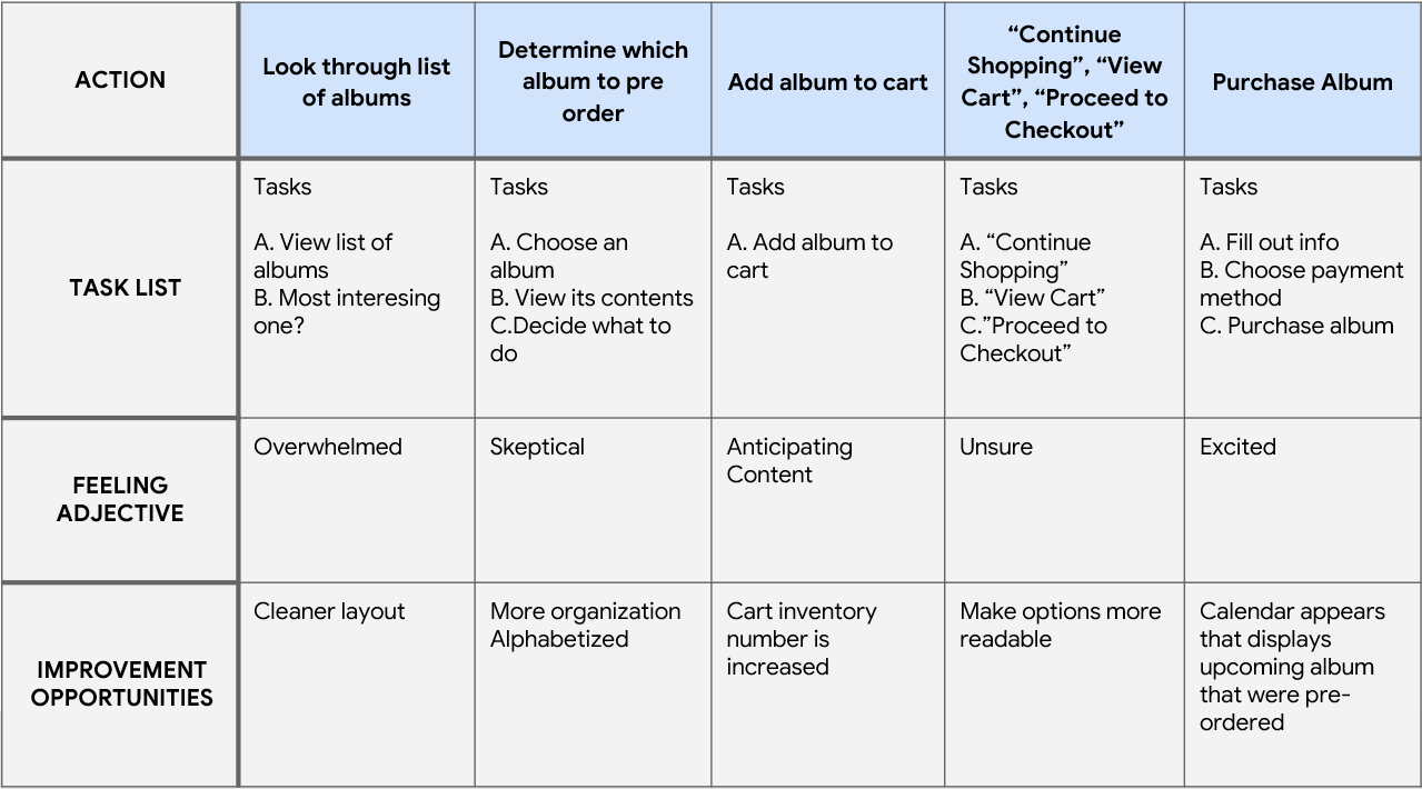
User Journey Map
By mapping Carly’s user journey, I discovered how valuable it would be to improve the design layout, ensuring a more intuitive and less overwhelming experience.
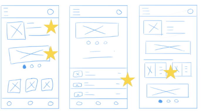
Paper Mockups
By iterating each screen on paper first, I ensured that the elements carried into digital wireframes were well aligned with the user in mind. On the home screen, I focused on the app’s primary flow — navigating music.
Digital Mockups
As the initial design phase continued, I made sure to base screen designs on feedback and findings from the user research.
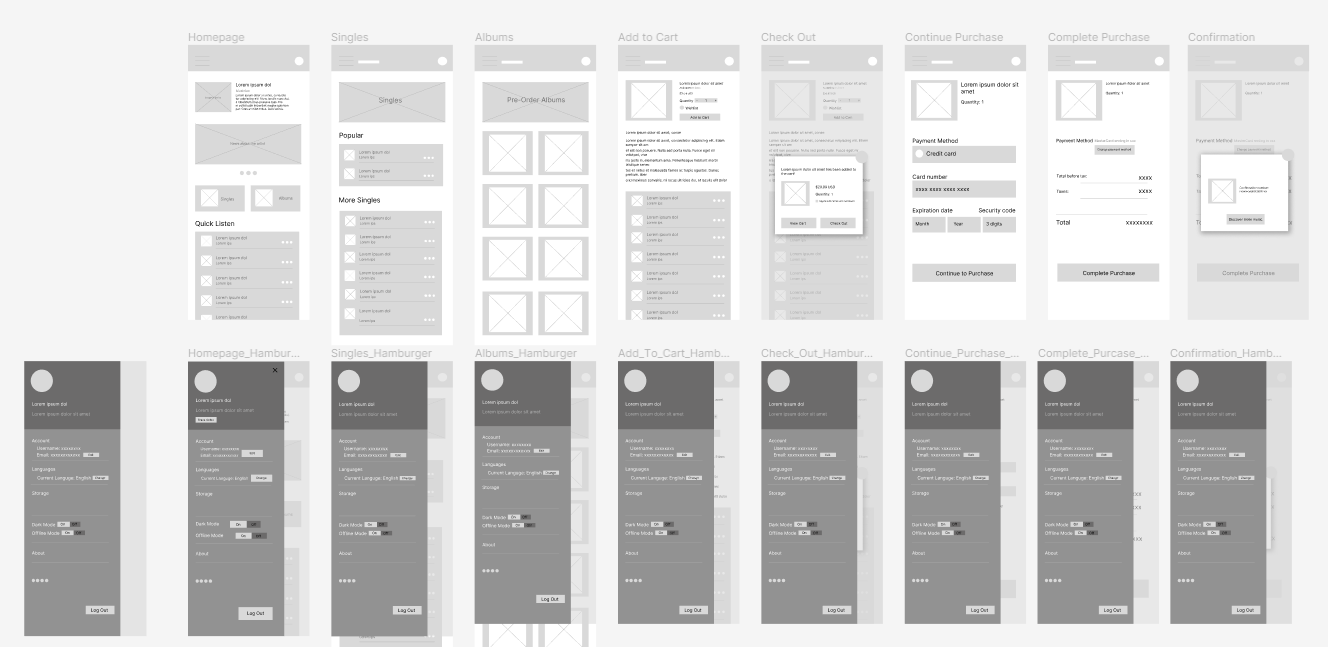
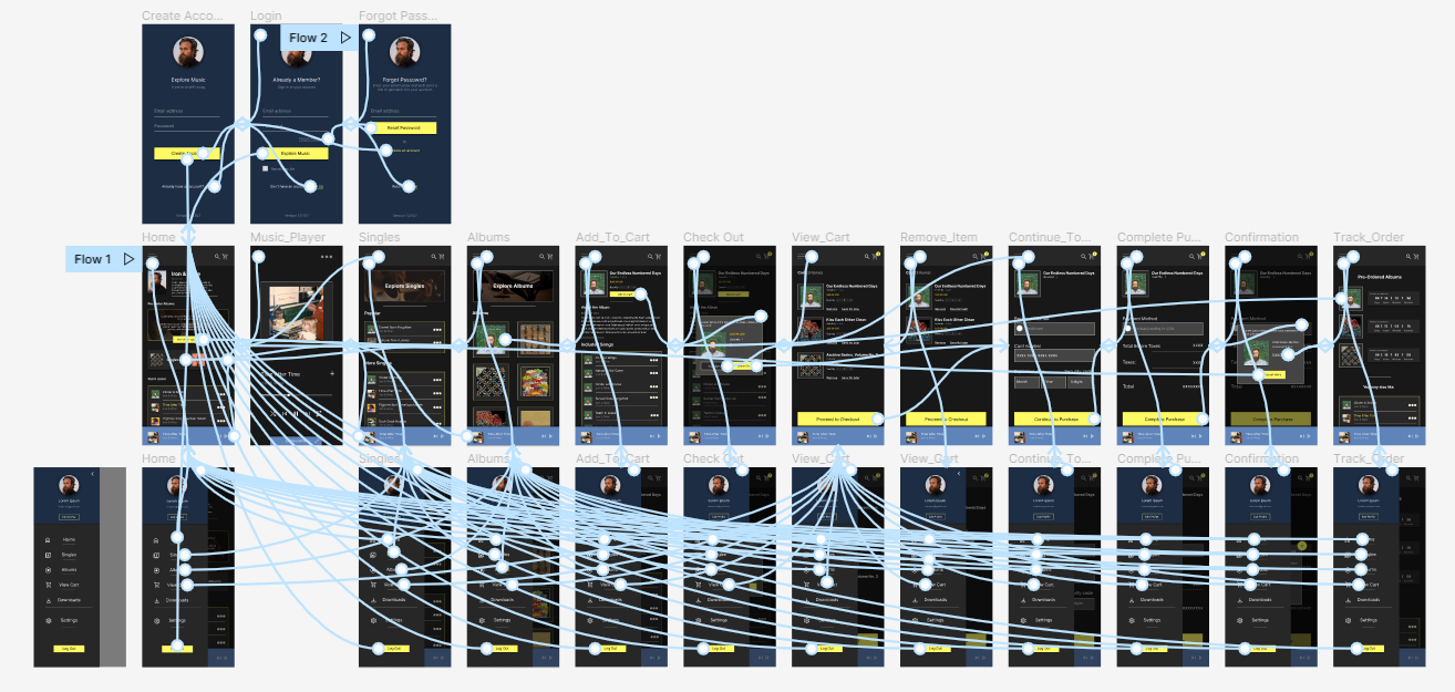
Digital Prototypes
As the design phase progressed, I ensured that each screen was informed by user research findings and feedback, grounding the designs in real user needs.

Usability Study: Findings
I conducted two rounds of usability studies. Insights from the first informed the transition from wireframes to mockups, while the second, using a high‑fidelity prototype, revealed which aspects of the mockups required refinement.
Round 1 findings:
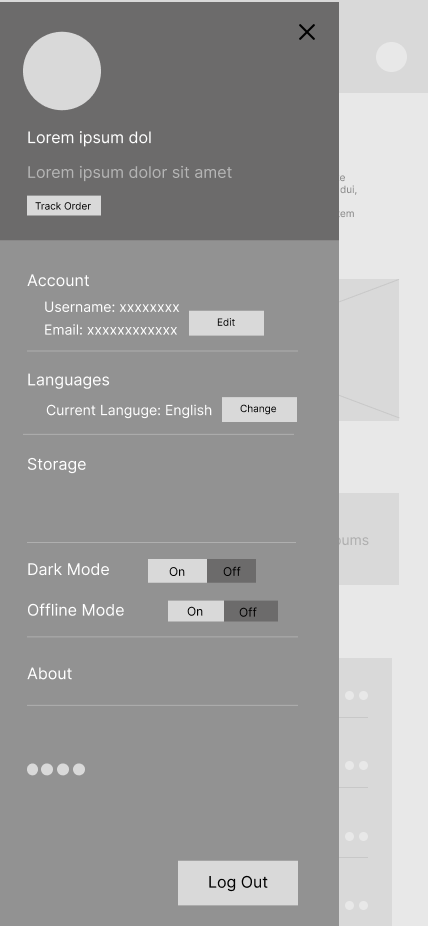
- certain text and buttons were undersized, which hindered readability and ease of interaction
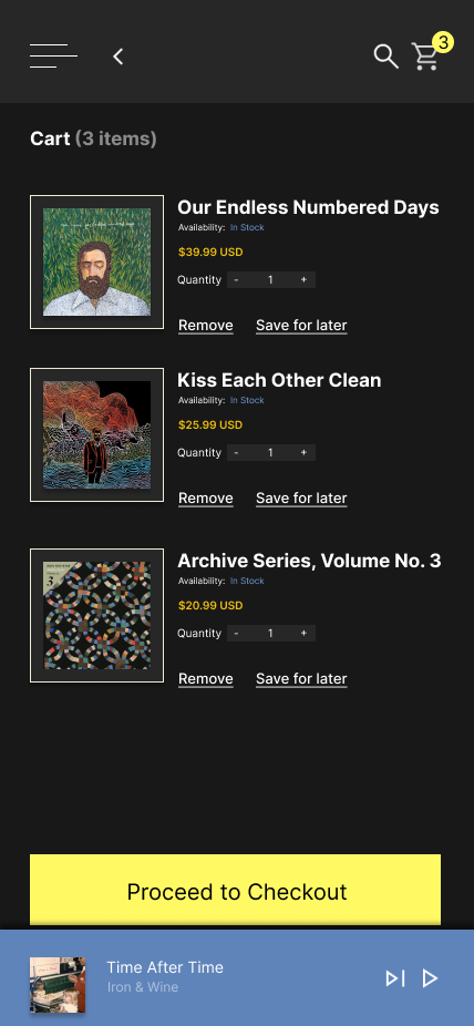
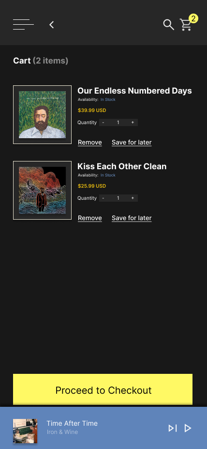
- users want the ability to easily remove items from their cart, ensuring greater control over their purchase decisions.
- users want the ability to track their orders, giving them visibility and reassurance throughout the purchase process.
Round 2 findings:
- homepage carousel was unnecessary and created confusion rather than enhancing navigation.
- the screens did not establish a strong focal point, which led to confusion and reduced clarity in the user experience.
- the accent color was not bold enough, limiting its ability to guide focus and emphasize key elements.
Mockup Iteraction
After reviewing the original design, I noticed it lacked visual appeal and clear focus, causing the eye to wander. Using feedback, I iterated on the design to make it cleaner and more accessible for users.
Before Usability Study
After Usability Study
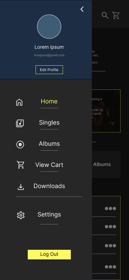
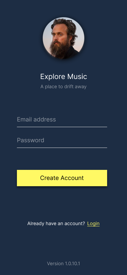
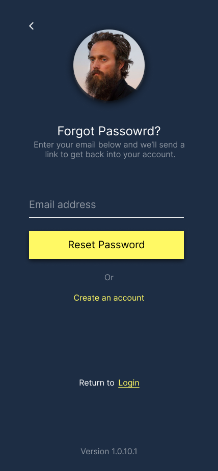
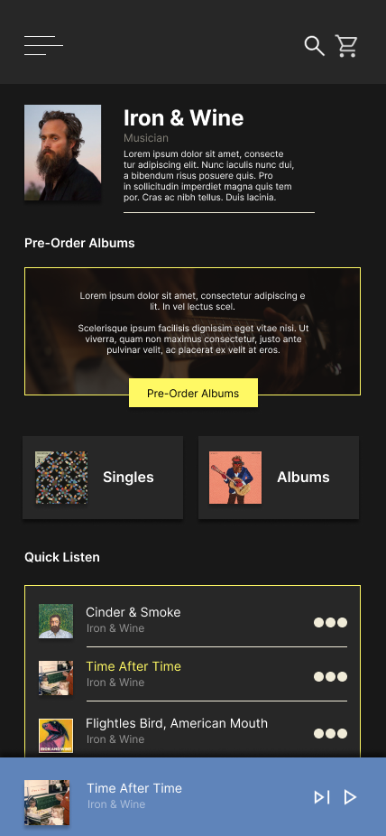
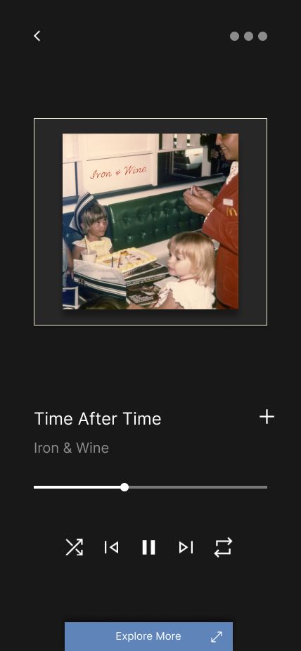
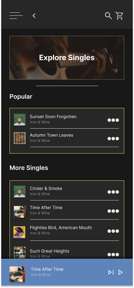
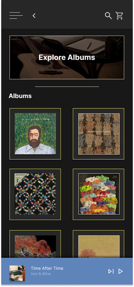
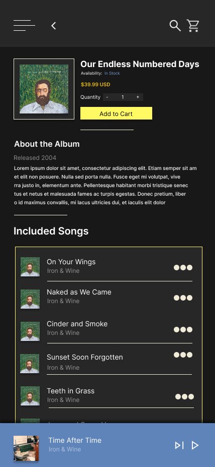
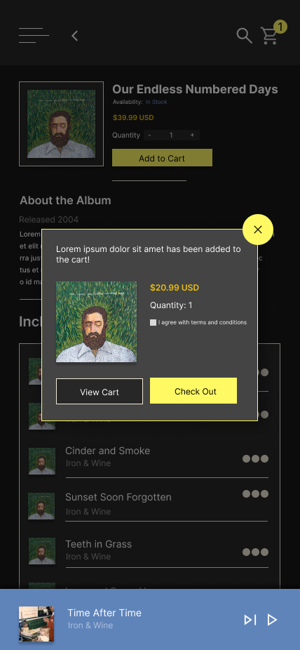
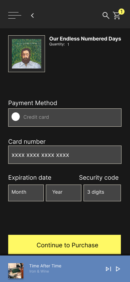
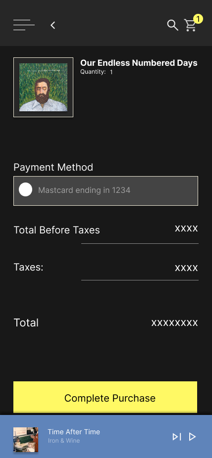
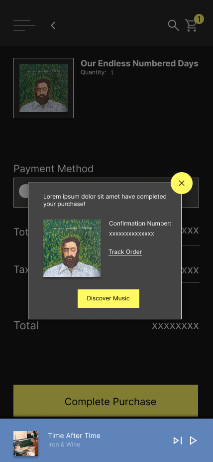
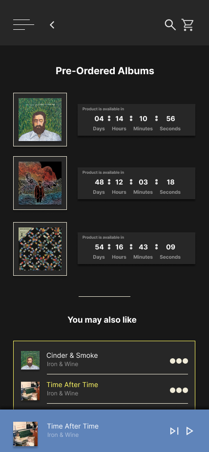
Final Mockups
Below are the final mockups, representing the culmination of research, iteration, and usability feedback. These designs showcase a cleaner, more accessible interface that aligns with user needs and enhances the overall experience.


High-fidelity Prototype
Using the completed set of digital wireframes, I developed a high‑fidelity prototype. The prototype focused on the core user flow: browsing albums, selecting one of interest, and completing a pre‑order.
View Prototype
Accessibility Considerations
1
Colors were selected that met Web Content Accessibility Guidelines (WCAG) standards, ensuring strong contrast and improved accessibility for all users.
2
Varying font sizes and weights were strategically used to establish hierarchy, making headers easily distinguishable and enhancing readability.
3
Annotations were included throughout the design files to guide developers and streamline the implementation process.
Next Steps
Conduct more user research to determine any new areas of need and iterate on the design
Conduct another round of usability studies to validate whether the pain points users experienced have been effectively addressed.