CareerPal
Figma | Photoshop | Mobile App & Responsive Web Design
Product
I created a cross‑platform utility that empowers people to begin new careers regardless of life stage, offering accessible tools to support career transitions and exploration.
Problem Statement - Users want opportunities to begin new careers regardless of life stage, while also having the flexibility to explore additional interests.
Project Overview
Create a way for users to find a career in a fun and educational way
UX Designer designing a cross-platform utility to help people start a new career
Conducting interviews, paper and digital wireframing, low/high-fidelity prototyping, conducting usability studies, accounting for accessibility, and iterating on designs
Design Process
I played an active role in every stage of the design process, from empathizing with users and generating ideas to prototyping and conducting rigorous testing, ensuring that the final solutions were both impactful and effective.
User Research: Summary
Through interviews, I gained a deeper understanding of the users and their needs. A key group identified during research were individuals at a stage in life where they wanted to begin a new career.
Users want opportunities to explore new careers while also pursuing emerging interests, highlighting the importance of flexibility and lifelong growth..
User Research: Pain Points
Support
Users want access to career resources
Process
Users want to find new interest
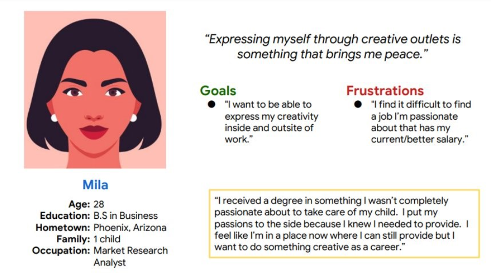
Persona
Problem Statement
Mila is a Market Research Analyst who needs a pathway to transition into a more fulfilling career. Her motivation stems from a desire to express her creativity not only in her professional life but also beyond the workplace.
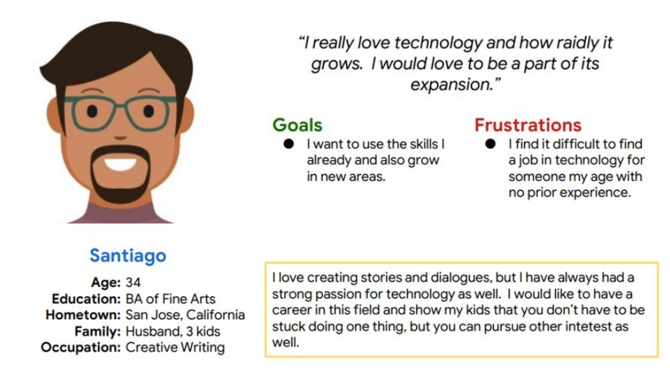
Problem Statement
Santiago is a Creative Writer who needs accessible pathways to enter the technology field. With no prior experience, he is motivated to find opportunities that allow him to leverage his creativity while building new technical skills.
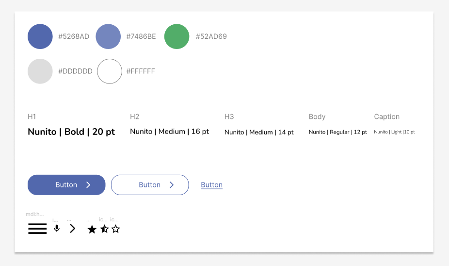
Sticker Sheet
I created a sticker sheet as a design guide, which helped maintain a consistent visual style and cohesive user experience across all stages of the design process.
Mobile
Website
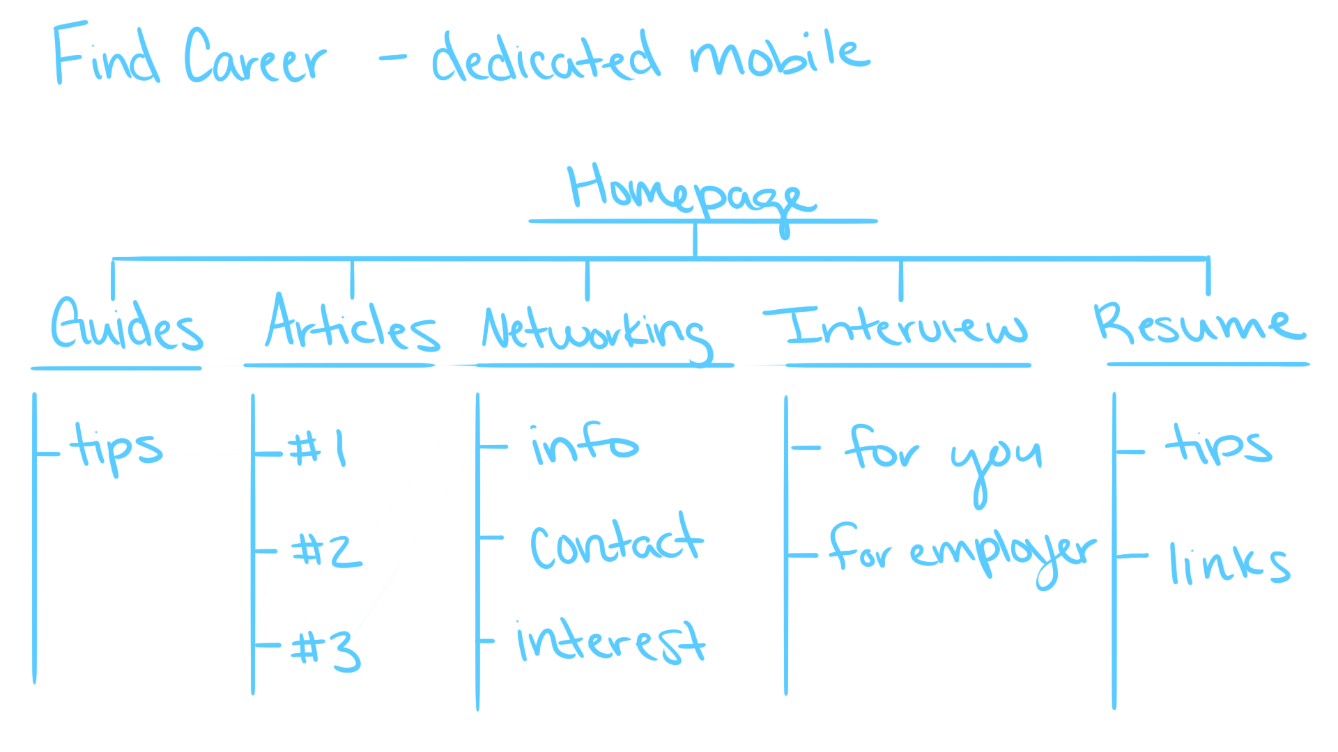
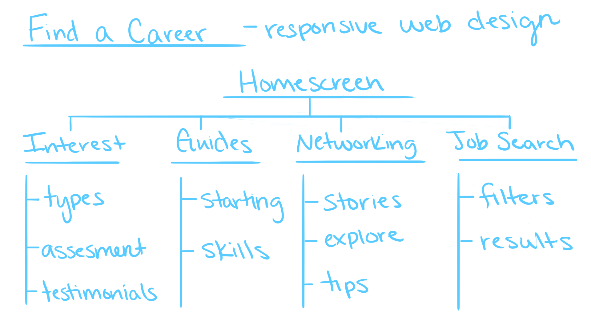
Information Architecture
In creating the information architecture, I prioritized incorporating a variety of resources that users could access more broadly. Since the majority of users will interact with the product on mobile devices, this approach ensured accessibility and usability across different contexts.
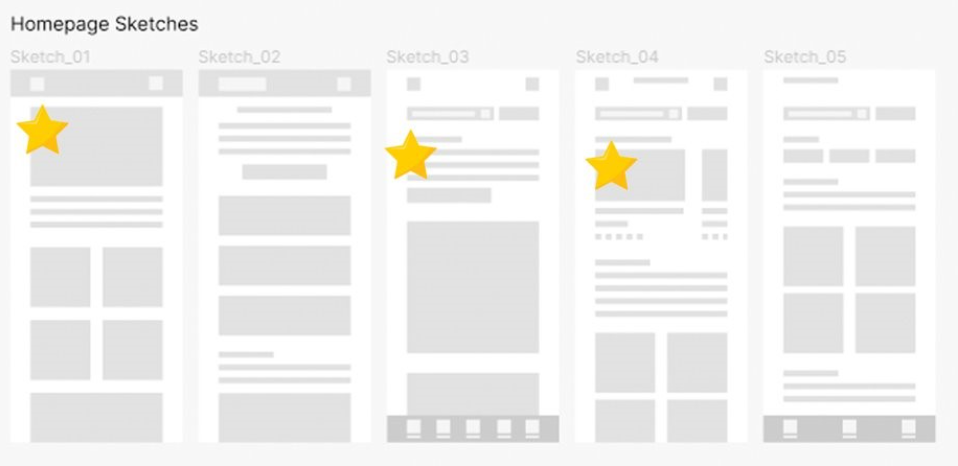
Dedicated Mobile - Sketches
I began by designing a hero image for the showcase and later integrated its contents directly into the image for a cleaner presentation. I also implemented a carousel section for articles and progressively added more elements to enrich the homepage.
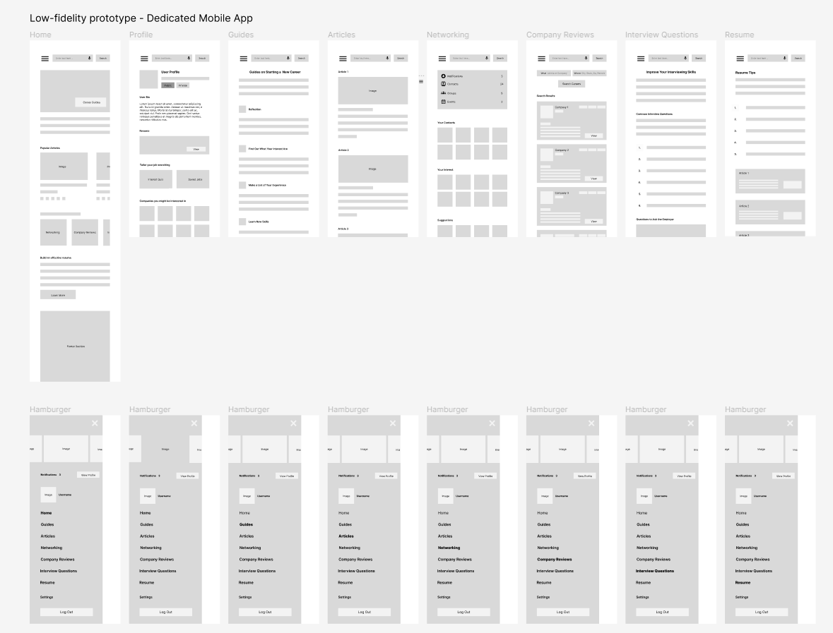
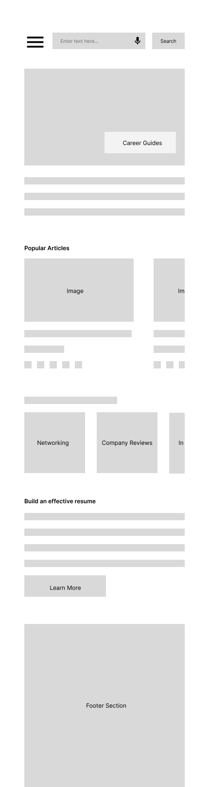
Dedicated Mobile - Low-fidelity Mockup
As the initial design phase progressed, I ensured that screen designs were informed by user research findings and feedback, creating solutions that directly addressed user needs.
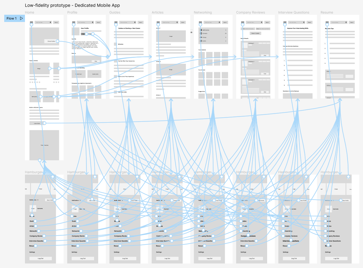
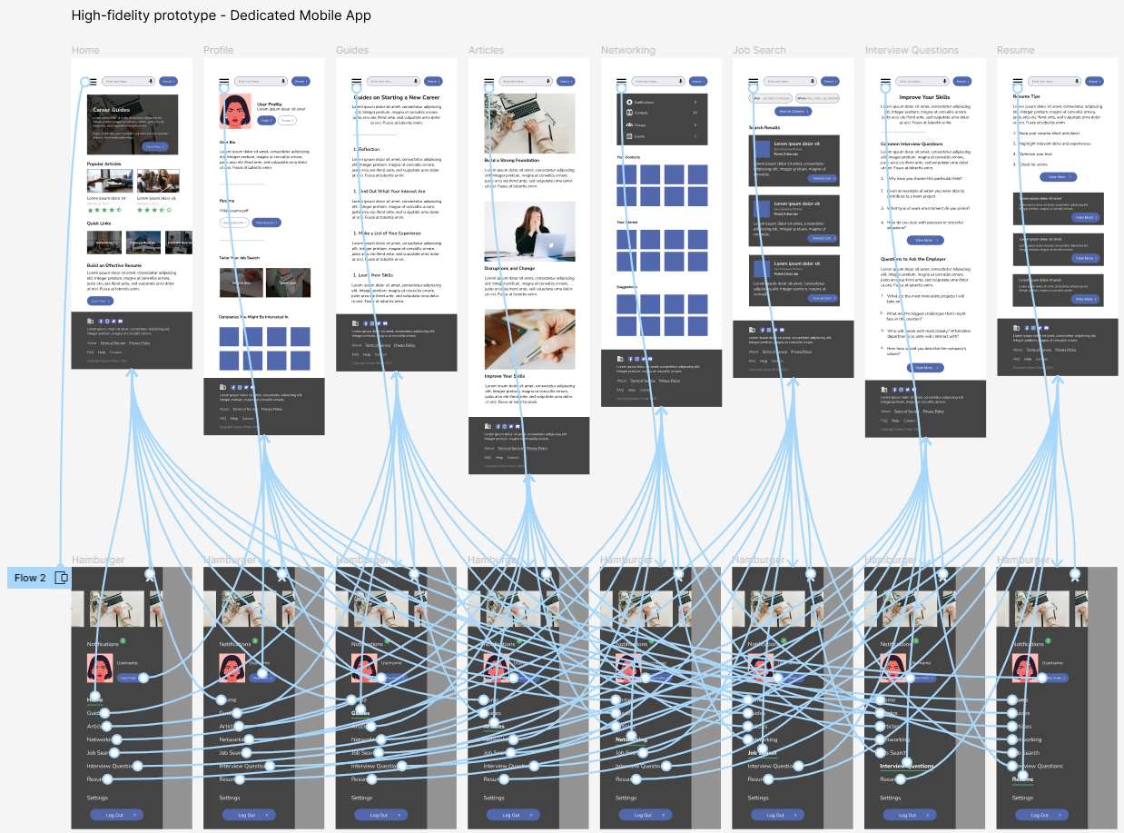
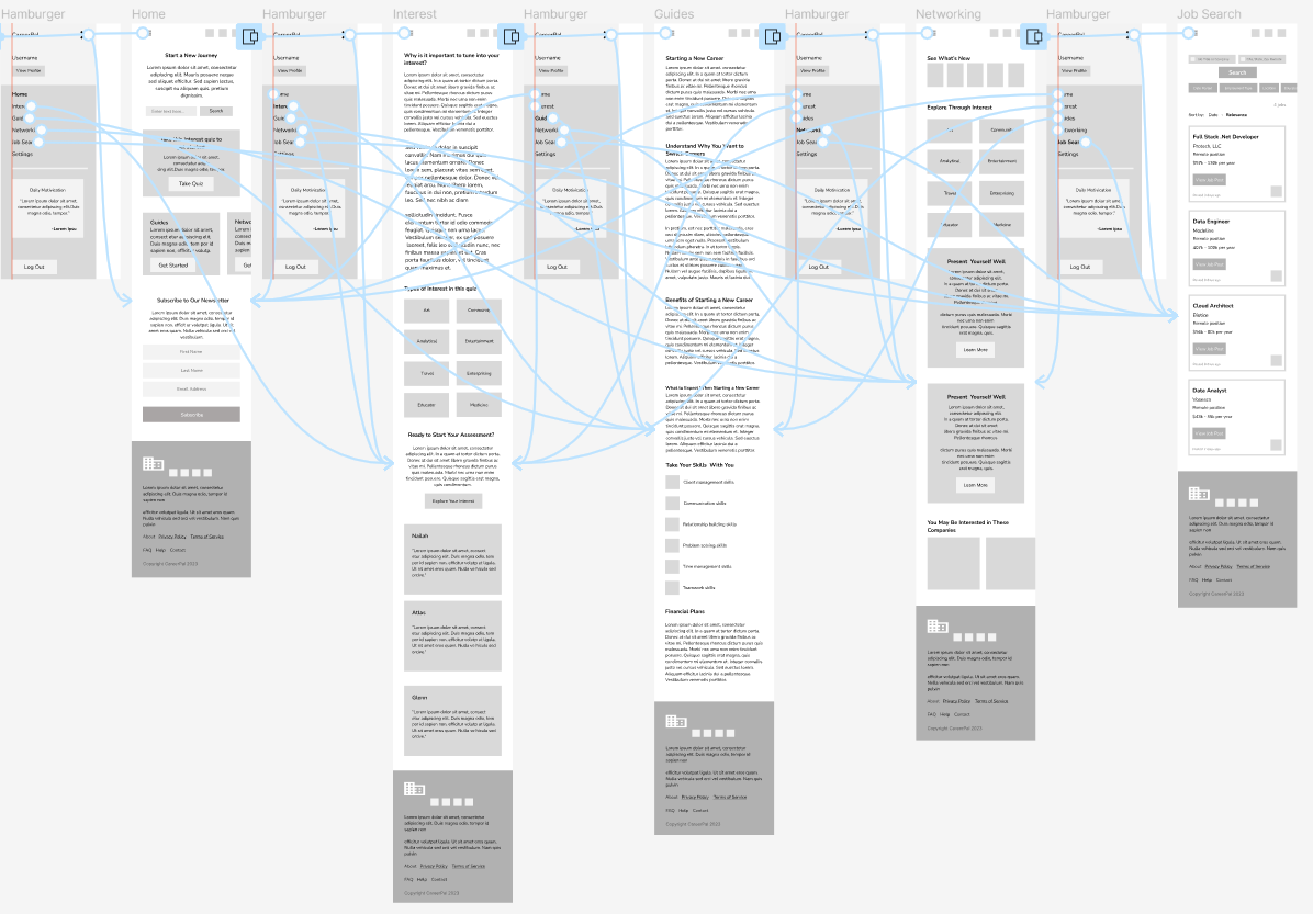
Dedicated Mobile - Low-fidelity Prototype
With the digital wireframes finalized, I created a low‑fidelity prototype that allowed me to validate user flows and gather early feedback before moving into high‑fidelity design.
Usability study: Findings
Round 1 findings
- Some text is too small and hard to read
Round 2 findings
- The layout of the profile page is not very consistent
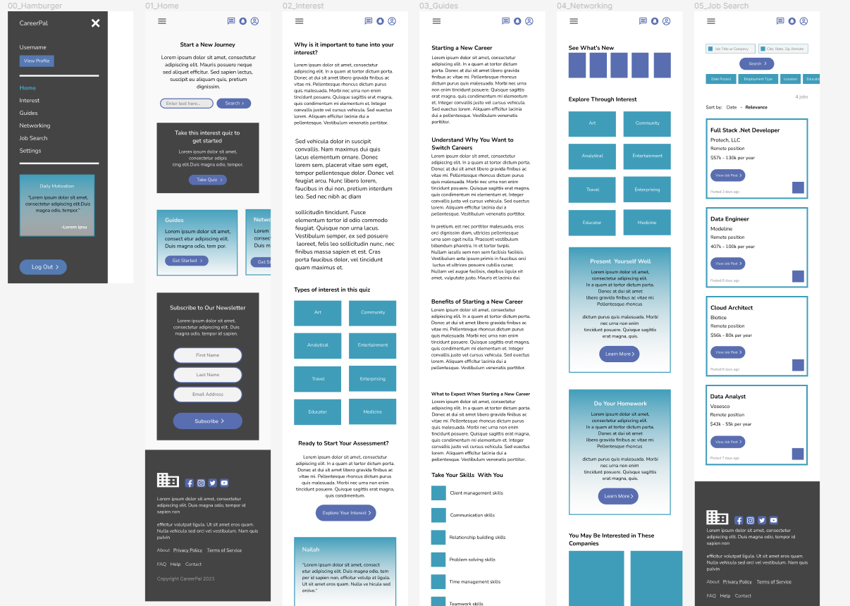
Dedicated Mobile - Mockups Iteraction
Upon reviewing the initial design, I refined the showcase area by moving the text inside the hero image for a cleaner presentation. I also converted the grid layout into a carousel slide to create a more dynamic and engaging experience.
Before Usability Study
After Usability Study
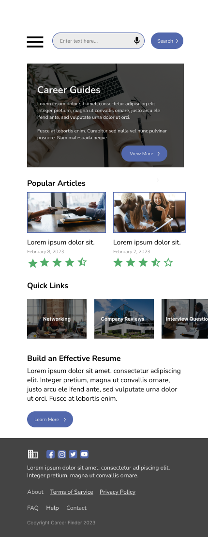
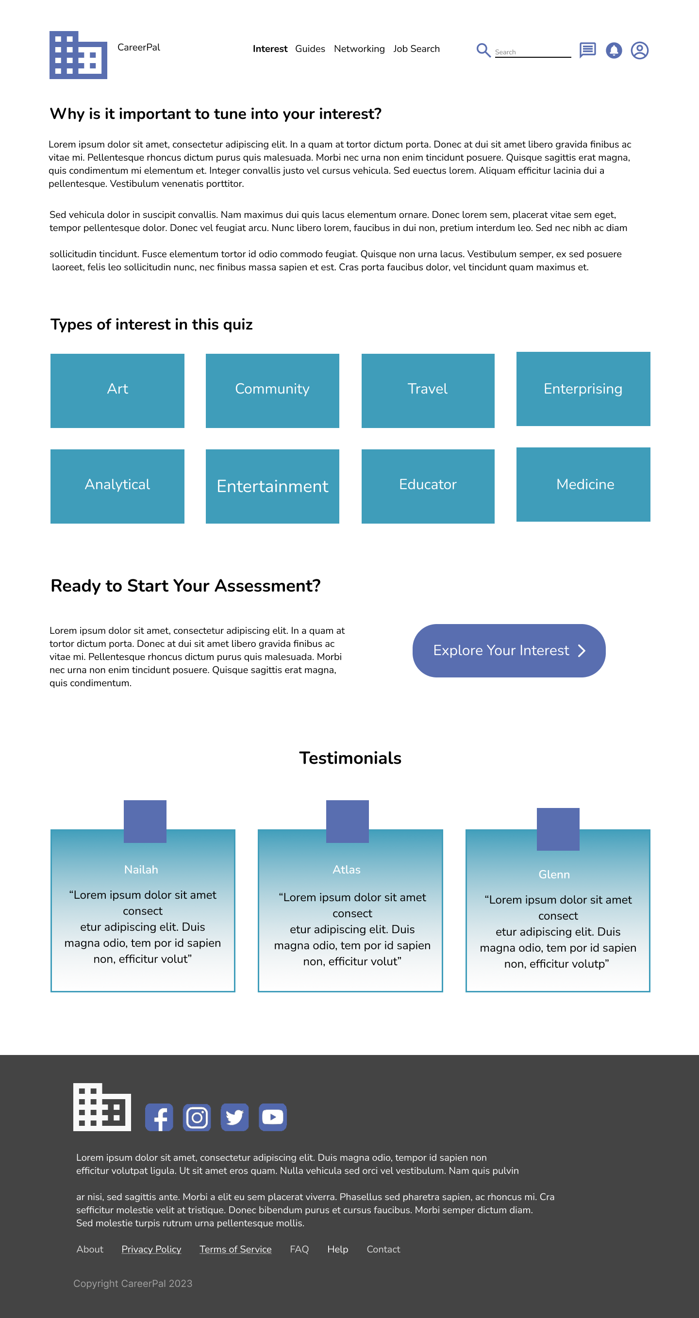
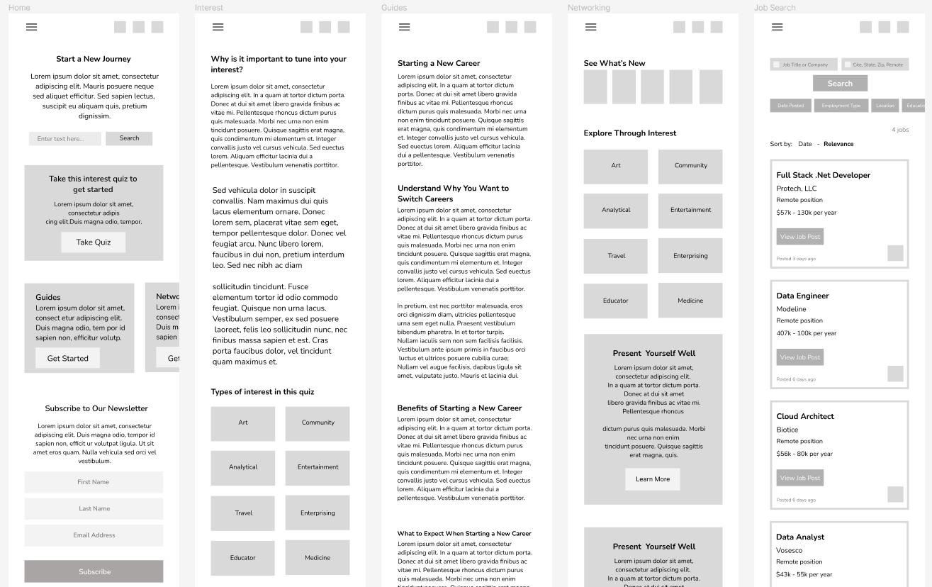
Dedicated Mobile - Final Mockups
Information Architecture
In designing the information architecture, I focused on delivering a streamlined experience that prioritized the most essential aspects of the product, ensuring users could quickly access what mattered most.
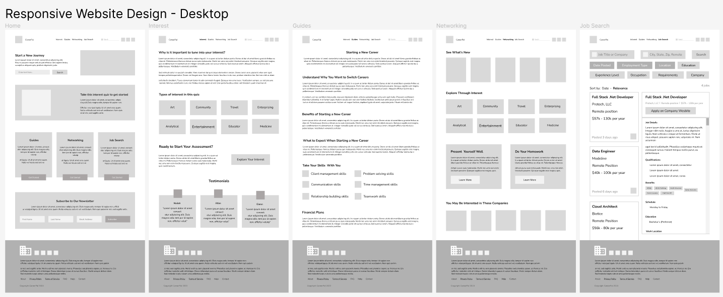
Desktop - Low-fidelity Mockup
As the design phase progressed, I consistently based screen designs on insights and feedback from user research, ensuring that each iteration aligned with user needs and expectations.
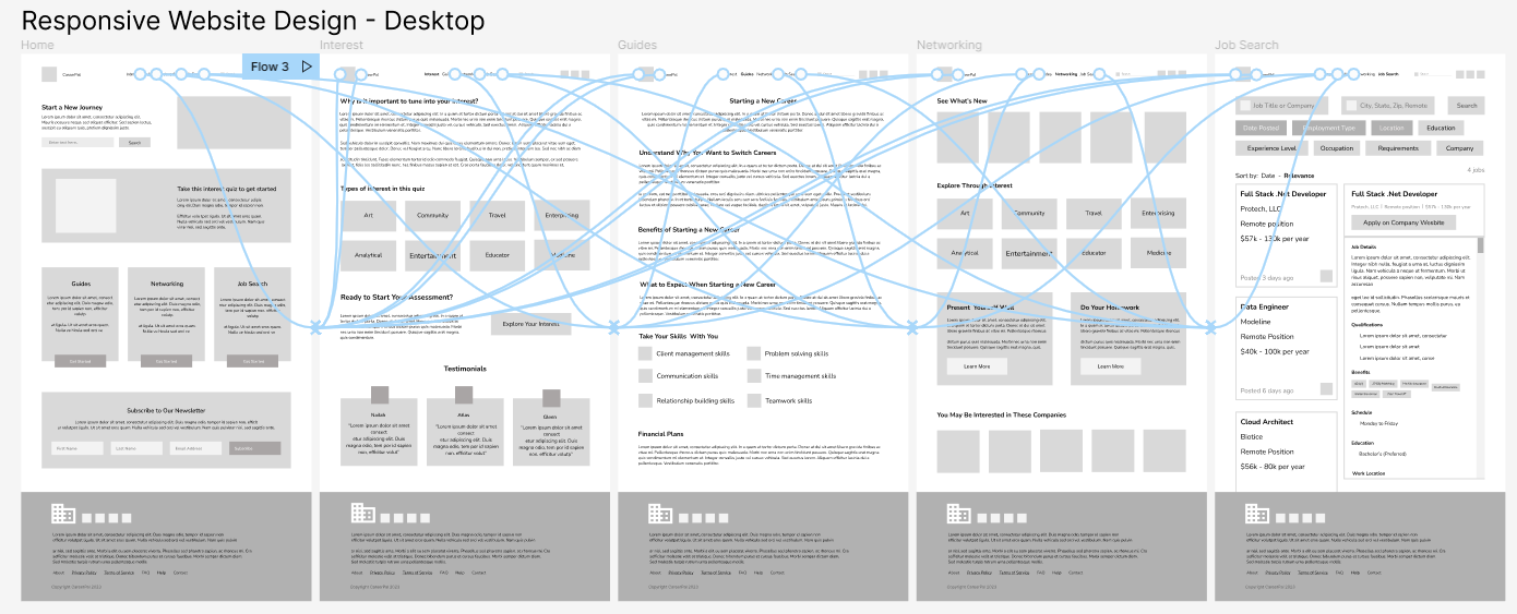
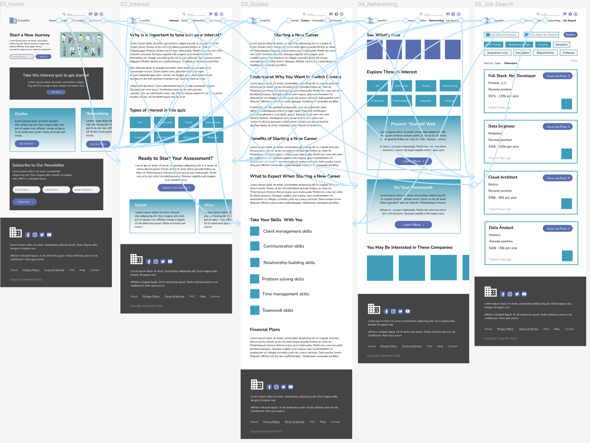
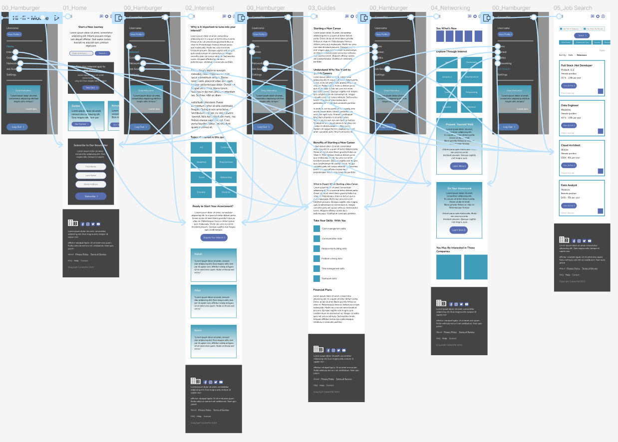
Desktop - Low-fidelity Prototype
With the digital wireframes finalized, I created a low‑fidelity prototype that allowed me to test navigation and gather early feedback before moving into high‑fidelity design.
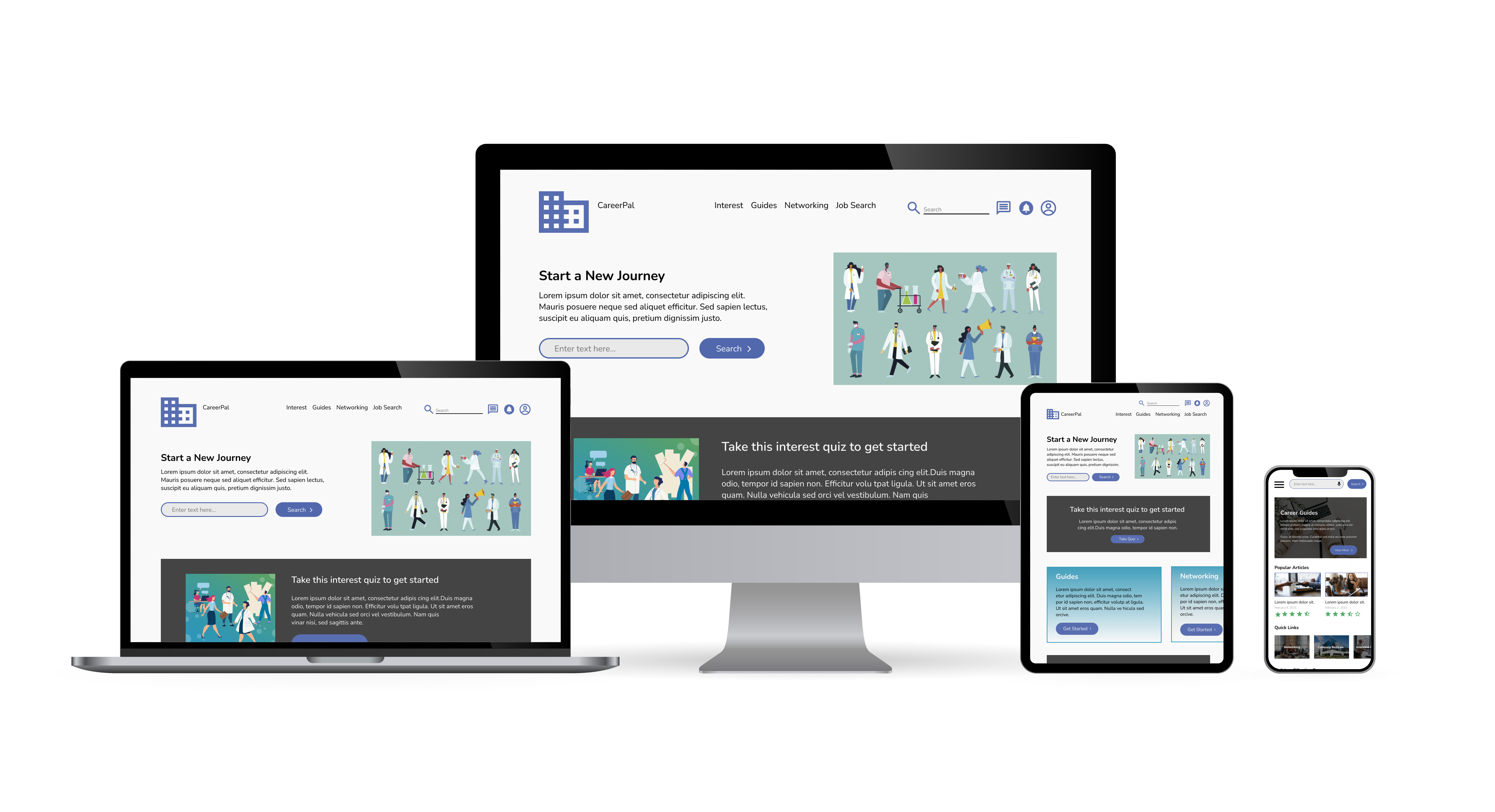
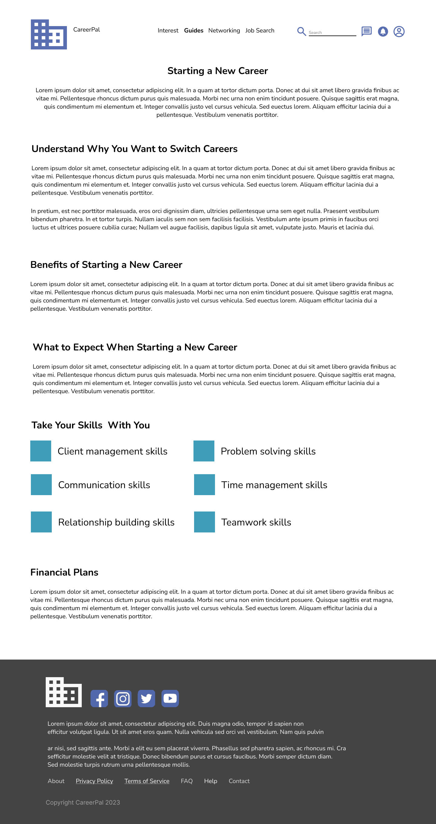
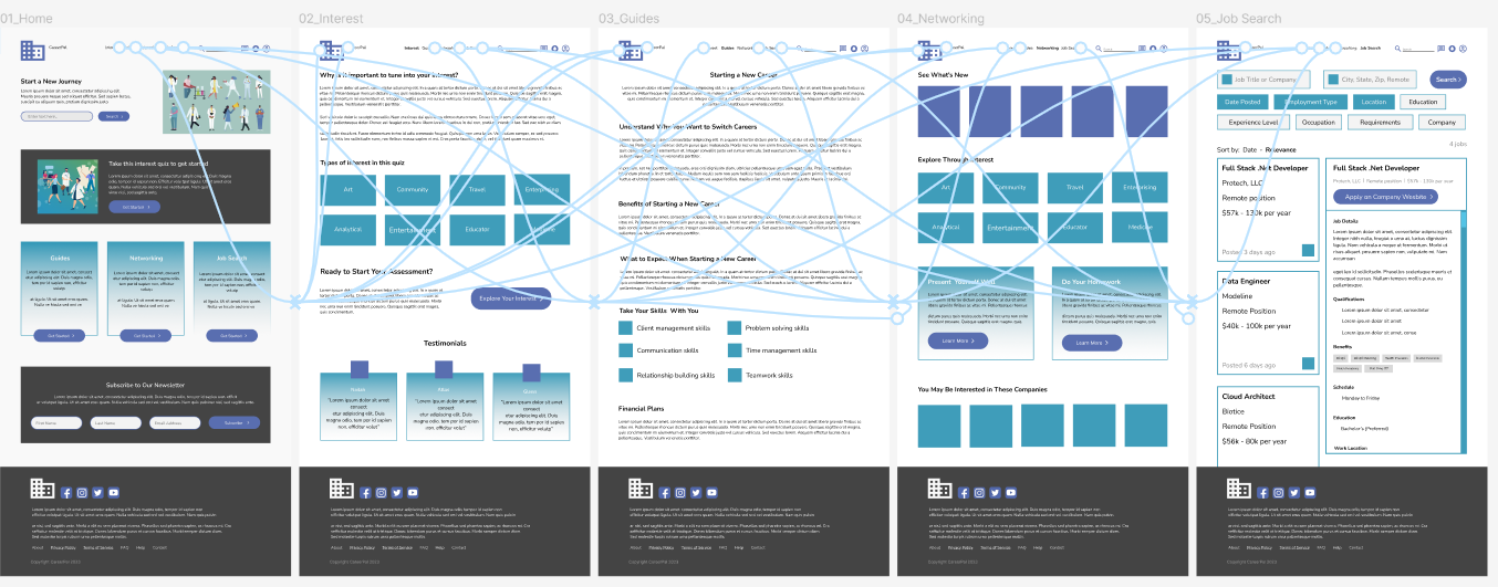
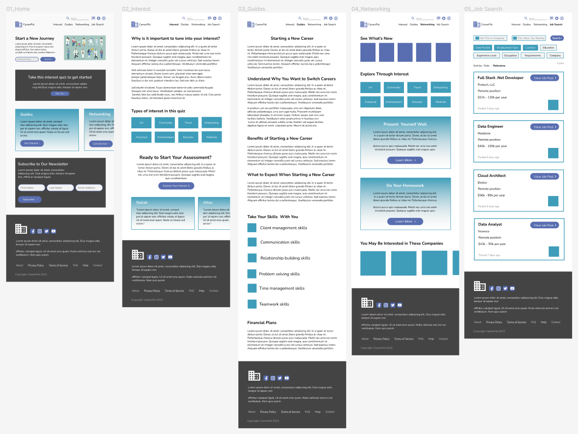
Desktop - Final Mockups

Tablet - Low-fidelity Mockup
As the initial design phase continued, I made sure to base screen designs on feedback and findings from the user research.
Tablet - Low-fidelity Prototype
Using the completed set of digital wireframes, I created a low-fidelity prototype.

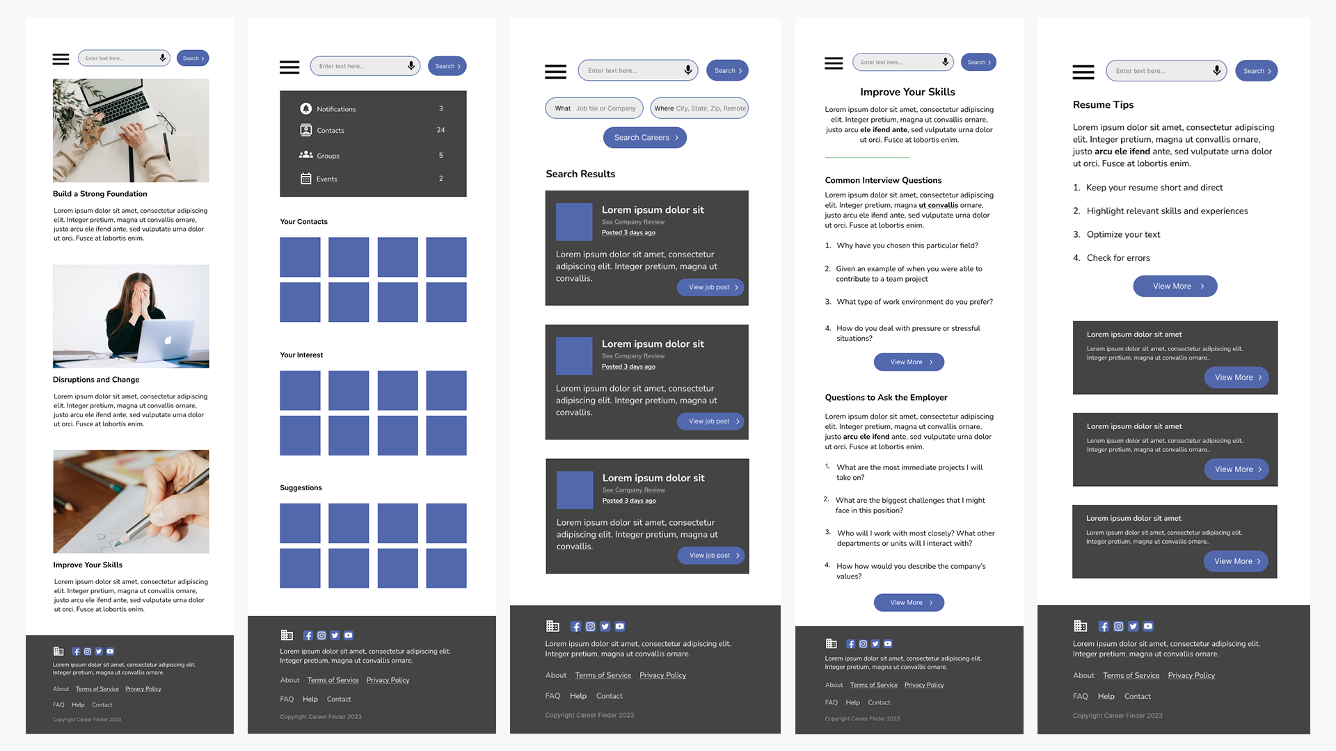
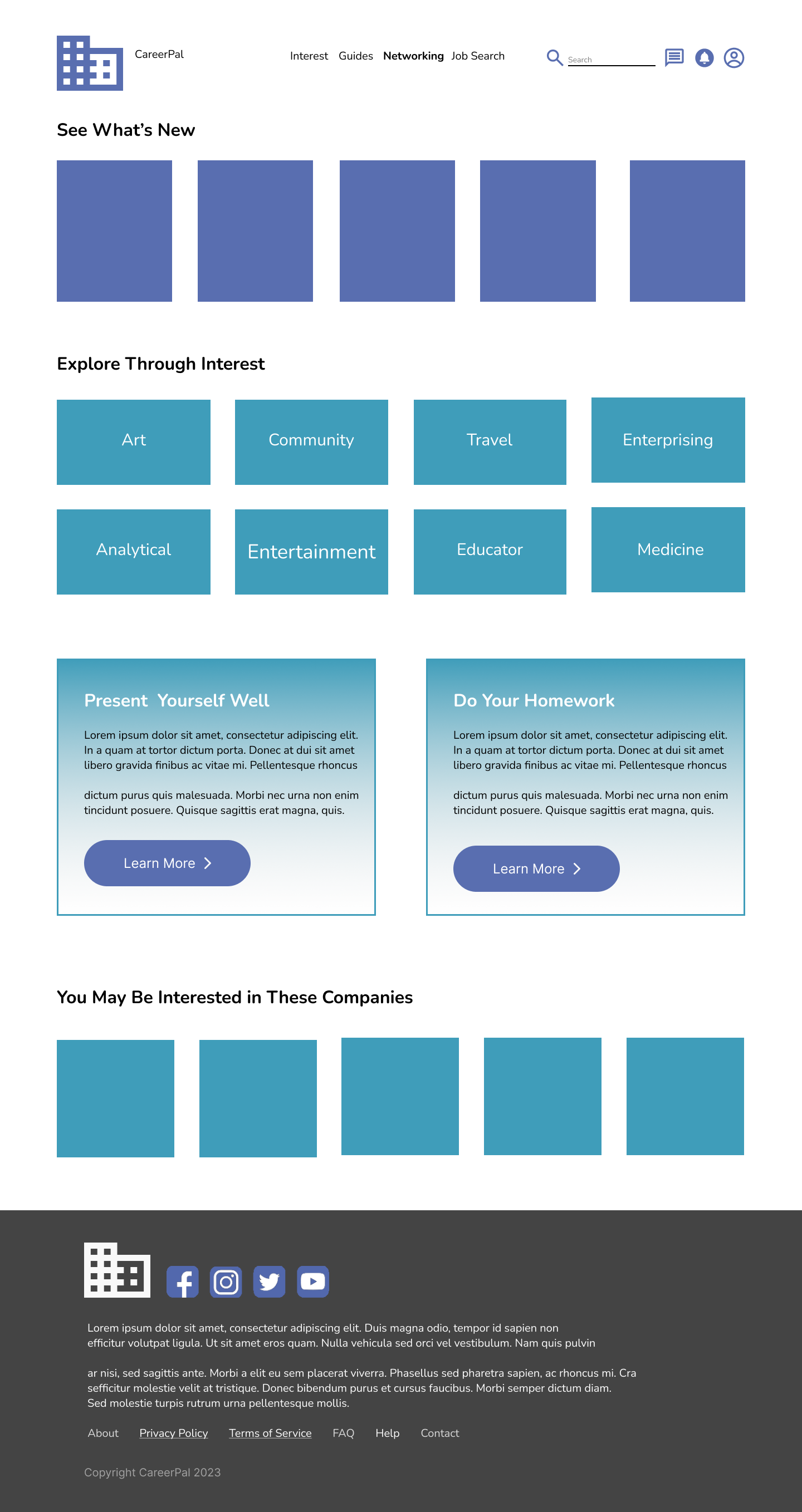
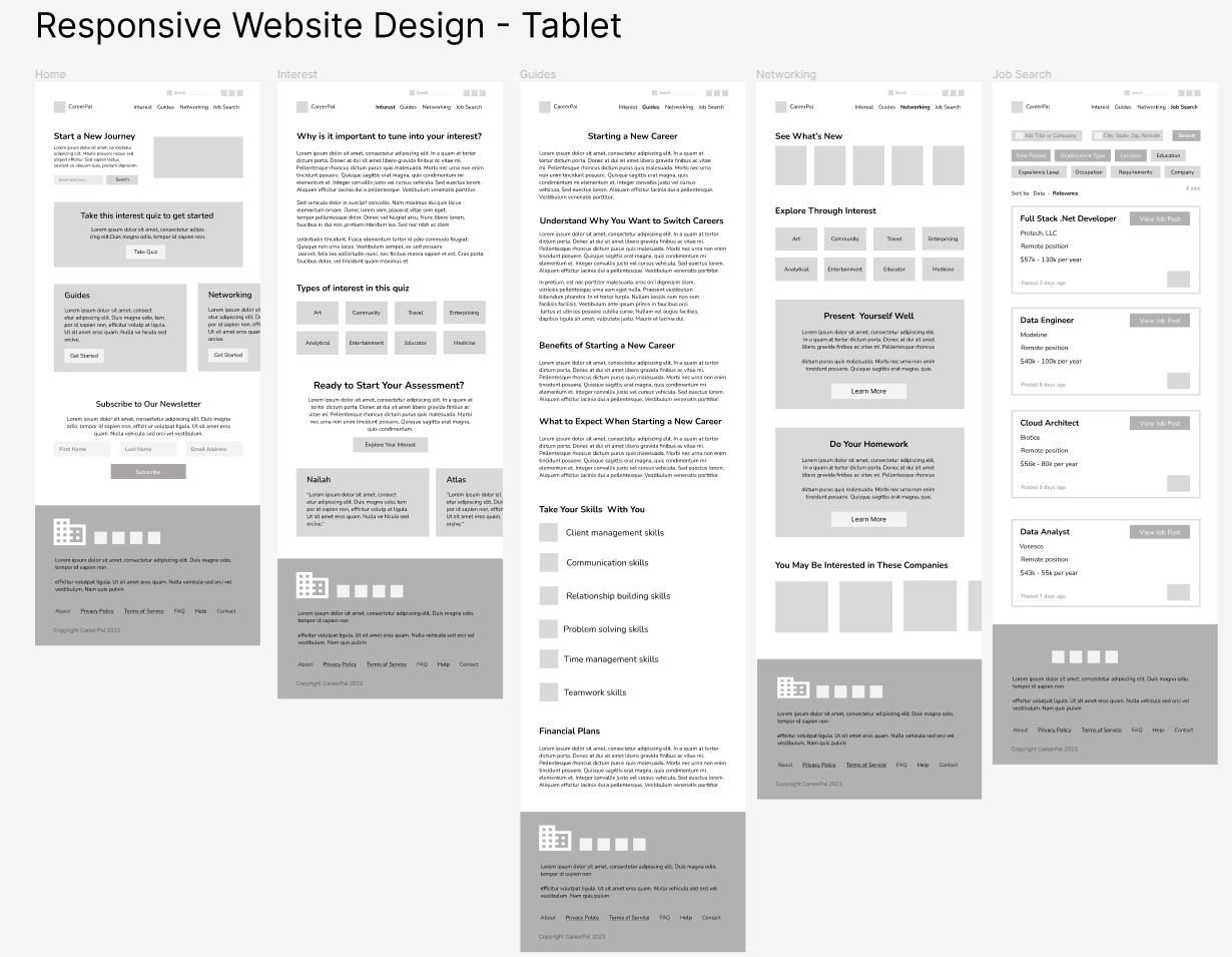
Tablet - Final Mockups
Mobile - Low-fidelity Mockup
As the initial design phase continued, I made sure to base screen designs on feedback and findings from the user research.
Mobile - Low-fidelity Prototype
Using the completed set of digital wireframes, I created a low-fidelity prototype.
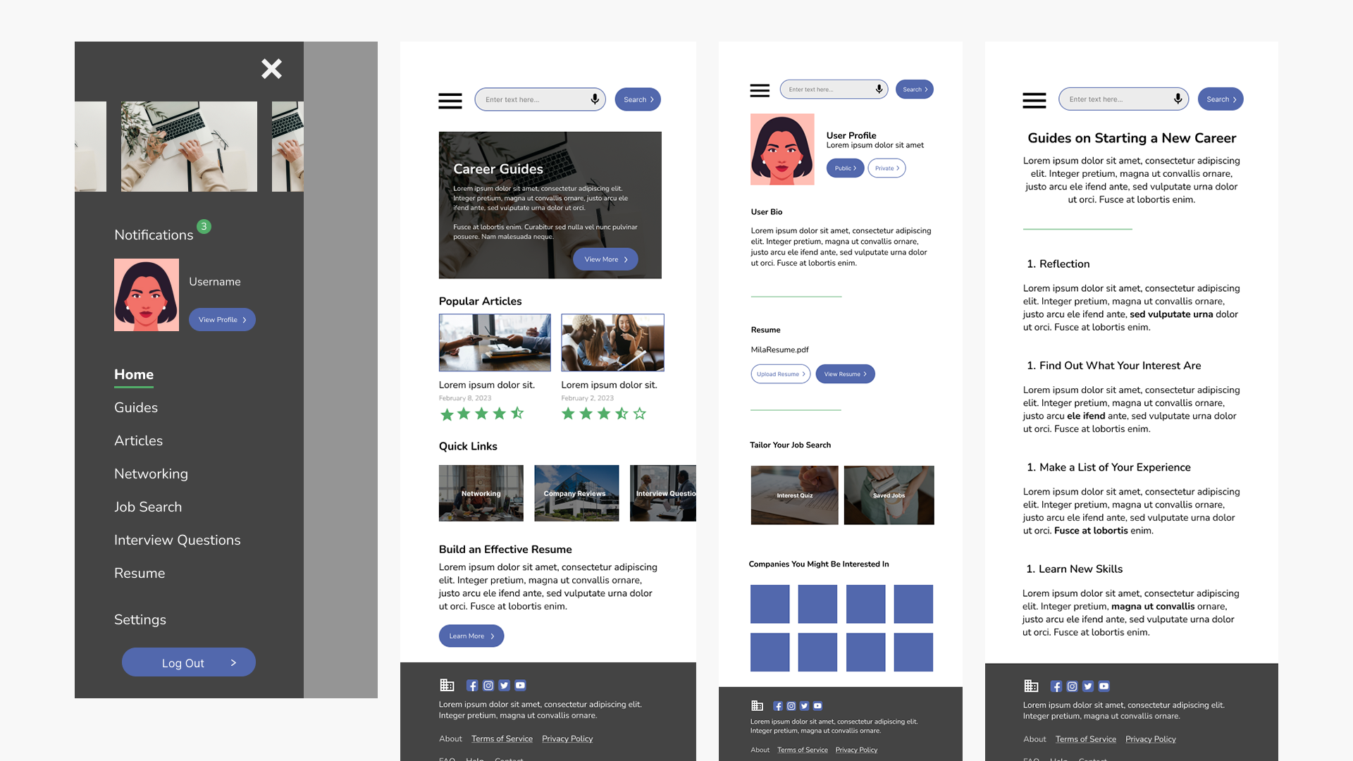
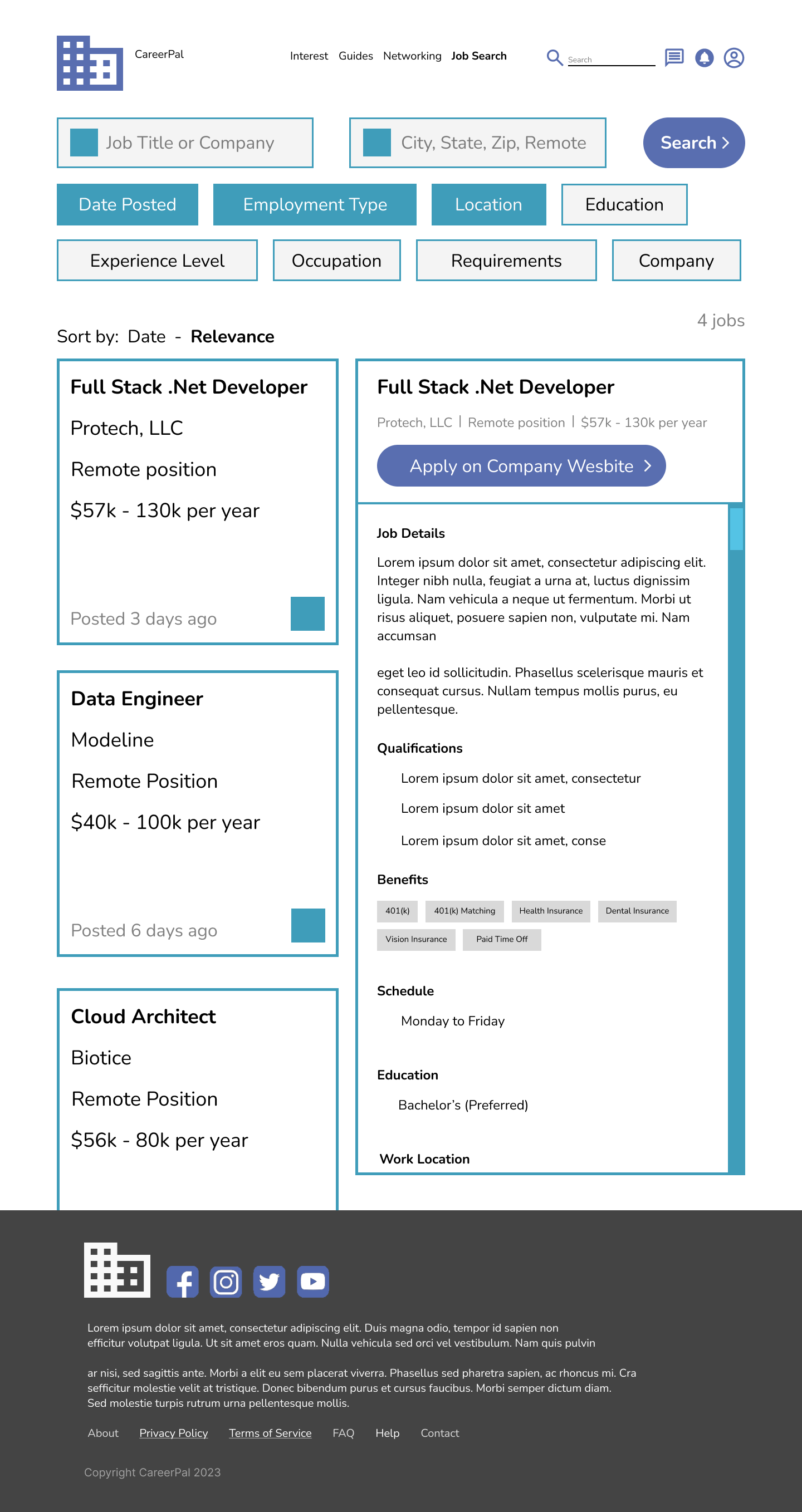
Mobile - Final Mockups
Accessibility Considerations
1
Used colors that met the Web Content Accessibility Guidelines (WCAG) standards
2
Different font sizes and font weight were used to easily distinguish between headers
3
Annotations were made to assist developers in their implementation process
Next Steps
Conduct more user research to determine any new areas of need and iterate on the design
Conduct another round of usability studies to validate whether the pain points users experienced have been effectively addressed